Introduction: Why This Matters in Logo Design
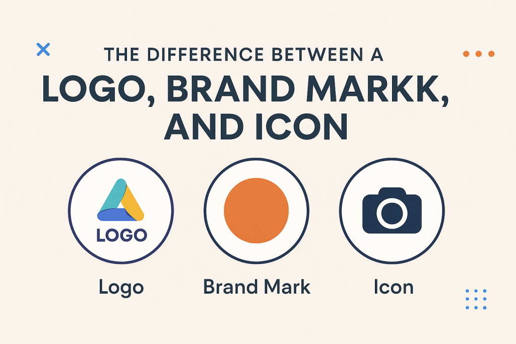
When people think about logo design, they often imagine a simple graphic that represents a brand. But here’s the truth — not all visuals in branding are the same. A logo, a brand mark, and an icon may look similar at first glance, but each plays a unique role in how people recognize and connect with your business.
Understanding these differences is essential if you want to build a strong, memorable brand identity. Whether you’re a business owner, designer, or marketer, this knowledge will help you communicate your brand more effectively — and avoid costly branding mistakes.
What is a Logo?
A logo is the primary visual representation of a brand. It’s a carefully crafted combination of text, symbols, or both, designed to identify and differentiate a business in the market.
Key features of a logo:
-
Usually includes the company name or initials.
-
Can be text-based (wordmark), image-based (symbol), or a combination.
-
Serves as the full representation of the brand in most contexts.
Example:
Coca-Cola’s red wordmark, Google’s colorful lettering, and Adidas’s three stripes with text are all logos — they work across all marketing materials to identify the brand.
What is a Brand Mark?
A brand mark is a simplified graphic or symbol that represents the brand without any text. It’s often an extension of the main logo but used in situations where space is limited or where the brand is already widely recognized.
Key features of a brand mark:
-
Purely visual (no text).
-
Can be a stylized shape, emblem, or icon.
-
Works best when the audience already knows the brand.
Example:
Apple’s bitten apple, Nike’s swoosh, and Twitter’s bird are all brand marks. Even without text, these visuals instantly remind people of the brand.
What is an Icon?
An icon is a simplified, often small-scale graphic used in digital or app-based contexts to represent an action, category, or tool — not necessarily the whole brand. While icons can be derived from a logo or brand mark, they serve more functional purposes.
Key features of an icon:
-
Minimal and optimized for small sizes.
-
Often used in apps, websites, or user interfaces.
-
May be part of a larger design system rather than the main brand identity.
Example:
The Instagram app icon, the blue “F” for Facebook in a browser tab, or the small shopping cart icon on an e-commerce site.
Logo vs Brand Mark vs Icon: Side-by-Side Comparison
| Feature | Logo | Brand Mark | Icon |
|---|---|---|---|
| Includes Text? | Usually yes | No | No |
| Primary Use | Full brand representation | Visual shorthand for brand | Functional graphic for digital use |
| Recognition Need | Works for new or known brands | Best for well-known brands | Recognizable within an interface |
| Example | Coca-Cola wordmark | Apple’s bitten apple | Instagram app symbol |
When to Use Each in Your Branding Strategy
Knowing the difference isn’t enough — you also need to know when to use each.
Use Your Logo When:
-
Introducing your brand to new audiences.
-
Creating official documents, ads, or website headers.
-
Applying on business cards, packaging, or merchandise.
Use Your Brand Mark When:
-
Space is limited (social media profile pictures, product stamps).
-
Your audience already recognizes your brand.
-
You want a minimal, clean look without text.
Use Your Icon When:
-
Designing a mobile or desktop app.
-
Representing a function on your website (menu, cart, search).
-
Needing small, clickable graphics that remain clear at tiny sizes.
Common Mistakes in Logo Design & Branding
Even big brands sometimes blur the lines between these elements. Here are common pitfalls to avoid:
-
Using a brand mark too early
If your brand is new, relying on a textless symbol can confuse people who don’t yet know you. -
Overcomplicating icons
Icons need to be simple enough to be legible at tiny sizes. Detailed designs often lose clarity. -
Using the wrong format
Always have your logo, brand mark, and icon in multiple file formats and sizes for different uses. -
Inconsistent branding
Switching randomly between logo, brand mark, and icon without a strategy can weaken brand recognition.
Expert Tips for Strong Logo Design
-
Start with the full logo first
Build recognition with your logo before introducing a standalone brand mark. -
Design with scalability in mind
Your visuals should work on a billboard and a mobile app icon without losing clarity. -
Maintain a consistent color palette
Consistency across logo, brand mark, and icon boosts recognition. -
Think long-term
Trends change, but your brand should be timeless. Avoid overly trendy design elements that might feel outdated quickly. -
Test across platforms
Check how your designs look on print, digital, mobile, and social media.
Real-World Example: Nike
-
Logo: The swoosh + the word “Nike.”
-
Brand Mark: Just the swoosh.
-
Icon: Simplified swoosh for app use.
Nike didn’t start with just the swoosh. In its early years, the word “Nike” was always part of the logo to build recognition. Only after global brand awareness did the swoosh stand alone.
Why Understanding These Differences Matters for Businesses
When you grasp the distinction between a logo, brand mark, and icon, you gain branding flexibility. You can adapt your visual identity to fit different contexts while maintaining recognition and consistency.
For small businesses, this clarity can prevent design waste and branding confusion. For established companies, it means smoother adaptation to new platforms and audiences.
Conclusion: Building a Cohesive Visual Identity
Logo design is more than just creating a pretty graphic — it’s about crafting a system of visuals that work together to tell your brand’s story.
Your logo is the foundation. Your brand mark is your shorthand. Your icon is your functional tool. Used strategically, they form a unified identity that resonates with your audience in every context — from billboards to app stores.
Call to Action
Now that you understand the difference between a logo, brand mark, and icon, it’s time to evaluate your own branding. Do you have all three? Are they consistent? If not, it might be time for a brand refresh.
Ready to upgrade your visual identity? Explore our logo design services and start building a brand that truly stands out.