Introduction
Imagine spotting a tiny swoosh on a pair of sneakers and instantly knowing it’s Nike. That’s the magic of exceptional logo design: it communicates a brand’s essence in a single glance. Whether you’re a startup founder or a seasoned designer, understanding what makes a great logo is crucial to creating a memorable identity. In this post, we’ll explore five key principles—backed by expert insights and real‑world examples—to help you elevate your next logo project.
Why Logo Design Matters
A logo is more than just an ornamental mark; it’s your brand’s front‑door ambassador. According to Nielsen Norman Group, consistent visual identity can increase revenue by up to 23%. A thoughtfully crafted logo:
-
Builds immediate recognition
-
Reinforces brand values
-
Sets you apart from competitors
Before diving into the five principles, let’s briefly compare successful and unsuccessful logos to illustrate the stakes.
| Criteria | Successful Logo (Apple) | Unsuccessful Logo (Hypothetical “TechXpress”) |
|---|---|---|
| Simplicity | A clean apple silhouette | Overly detailed circuit‑board illustration |
| Versatility | Scales from billboards to favicons | Loses detail when scaled down |
| Memorability | Instantly recognizable worldwide | Blends into a sea of tech logos |
| Relevance | Conveys innovation and approachability | Mixed signals; too many colors and elements |
| Timelessness | Decades‑old shape still modern | Styles tied to a fleeting “tech bubble” trend |
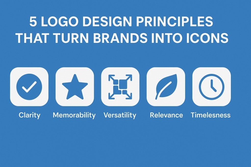
Principle 1: Clarity & Simplicity
“Good design is as little design as possible.” — Dieter Rams
A clear, simple logo ensures instant recognition. Overly complex designs burden the viewer’s mind, making the logo hard to recall. Consider the Twitter bird: a single, fluid shape that works at any size.
Tips for Simplicity
-
Limit color palette to 1–2 hues.
-
Avoid intricate details that vanish when scaled.
-
Focus on a single concept or shape.
Principle 2: Memorability
Memorable logos stick in the viewer’s mind long after the first glance. This often stems from a unique twist—think of FedEx’s hidden arrow.
How to Boost Memorability
-
Unexpected Element: Incorporate a clever visual trick.
-
Strong Silhouette: Ensure your logo is recognizable as a flat shape.
-
Emotional Connection: Use forms or colors that resonate emotionally (e.g., warm reds for passion).
Principle 3: Versatility
A versatile logo adapts to any context—websites, billboards, merchandise, or black‑and‑white print. The American Institute of Graphic Arts recommends testing your logo across multiple mediums before finalizing.
Ensuring Versatility
-
Create versions in full color, one color, and reverse color.
-
Design with vector formats (SVG, EPS) to maintain crispness.
-
Check readability at sizes from 16×16 px (favicon) to 10 ft signs.
Principle 4: Relevance to Brand Identity
A logo must reflect the industry, target audience, and brand personality. A playful children’s toy brand should avoid sharp, aggressive shapes, while a financial institution might favor solid, trustworthy forms.
Aligning with Your Brand
-
Color Psychology: Use blues for trust, greens for growth, reds for energy.
-
Typography Choice: Rounded sans‑serifs convey friendliness; serifs suggest tradition.
-
Symbolism: Select icons that echo your core service—e.g., a leaf for eco‑friendly products.
Principle 5: Timelessness
Trendy logos may look fresh today but feel dated in five years. Aim for a design that transcends fads, like Coca‑Cola’s script from 1886.
Crafting Timeless Designs
-
Study classic logos that have endured decades.
-
Avoid trendy typography or effects (e.g., excessive gradients).
-
Focus on fundamental shapes and clear concepts.
Putting It All Together: A Case Study
Let’s revisit the hypothetical “TechXpress” rebrand:
-
Before: A cluttered, multi‑colored emblem with circuits.
-
After applying principles:
-
Simplicity: Reduced to a two‑tone monogram “TX.”
-
Memorability: Integrated a forward arrow within the “X.”
-
Versatility: Works on dark and light backgrounds, from app icons to vans.
-
Relevance: Monogram style targets tech‑savvy professionals.
-
Timelessness: Clean lines ensure longevity beyond current tech trends.
-
Visual Summary
| Principle | Action Item | Example |
|---|---|---|
| Clarity | Limit to 1–2 colors, avoid small details | Nike swoosh |
| Memorability | Add a unique twist or hidden element | FedEx arrow |
| Versatility | Create multicolor, one‑color, and reversed versions | Apple logo |
| Relevance | Match colors, fonts, and symbols to brand personality | Starbucks green circle |
| Timelessness | Emphasize fundamental shapes; avoid effects | Coca‑Cola script |
Infographic placeholder: “5 Principles of Great Logo Design”
Internal & External Resources
-
Internal: Explore our Logo Design Services to see how we apply these principles.
-
External: Learn more about color psychology at Pantone’s Color Institute.
-
Tool Recommendation: Try Adobe Illustrator for creating vector-based logos.
Conclusion & Next Steps
Great logo design blends art and strategy. By prioritizing clarity, memorability, versatility, relevance, and timelessness, you’ll craft logos that resonate and endure. Ready to transform your brand identity?
CTA: Share your favorite logo redesign in the comments below, or book a free consultation to get expert feedback on your logo!