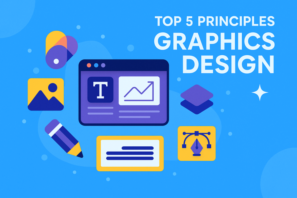
Top 5 Principles Every Designer Should Know
In the vibrant world of graphics design, aesthetics meet functionality. Great design isn’t about making things look pretty; it’s about solving problems visually. Whether you’re designing logos, websites, or marketing materials, understanding foundational principles helps you make intentional, impactful decisions.
So, what separates amateur designers from professionals? It often boils down to a firm grasp of core design principles. In this post, we’ll unpack the top five principles every designer should know—not just to follow rules, but to break them with purpose.
1. Balance: Creating Visual Stability
Balance refers to the visual distribution of elements in a design. Just like physical balance, visual balance gives a sense of stability and harmony to your layout.
Types of Balance:
- Symmetrical Balance: Both sides of the design mirror each other. It creates formality and structure.
- Asymmetrical Balance: Elements differ on each side but still feel balanced. It adds dynamism and modernity.
- Radial Balance: Elements radiate out from a central point, often used in logos and circular layouts.
Why It Matters:
An unbalanced design feels awkward and unprofessional. Balanced compositions guide the viewer’s eye naturally and maintain visual interest.
Tip: Use a grid system in software like Adobe Illustrator or Figma to maintain structure.
2. Contrast: Highlighting What Matters
Contrast helps draw attention to important elements. It could be a difference in color, size, shape, texture, or type.
Examples of Effective Contrast:
- Light text on a dark background
- A bold headline paired with thin body text
- Circular elements in a design dominated by rectangles
Why It Matters:
Contrast not only improves readability but also builds hierarchy. It tells the viewer what to look at first and why it matters.
Real-World Insight: Ever notice how a call-to-action button is always a standout color? That’s contrast in action.
3. Alignment: Establishing Order
Without alignment, your design will appear chaotic. Alignment refers to how elements line up within the layout.
Types of Alignment:
- Left/Right Alignment: Used in most Western layouts
- Center Alignment: Great for invitations or formal designs
- Justified Alignment: Often used in newspapers and magazines
Why It Matters:
Proper alignment creates a clean, professional appearance. It reduces cognitive load, allowing viewers to focus on the message instead of navigating clutter.
Tip: Snap-to-grid and smart guides in design software help keep everything in line.
4. Repetition: Creating Consistency
Repetition strengthens a design by tying together elements through recurring themes or motifs.
Examples:
- Consistent typography across all slides of a presentation
- Repeating colors in a brand palette
- A recurring shape or icon throughout a brochure
Why It Matters:
Repetition builds familiarity and reinforces branding. It makes your design feel intentional and cohesive.
Bonus: This principle is crucial in UI/UX design where consistency enhances user experience.
5. Proximity: Improving Comprehension
Proximity deals with how close or far elements are from each other. Grouping related items together improves understanding.
Example Applications:
- Grouping contact info in the footer of a webpage
- Keeping a headline close to its paragraph
- Using whitespace to separate unrelated content
Why It Matters:
Proximity organizes information. It ensures that users don’t have to guess which elements belong together.
Tip: Use whitespace strategically. It’s not “empty” space; it’s powerful breathing room for your content.
Bonus Table: Quick Comparison of Principles
| Principle | Purpose | Common Tools Used |
|---|---|---|
| Balance | Achieve visual stability | Grids, symmetry tools |
| Contrast | Draw attention, build hierarchy | Color pickers, font pairing |
| Alignment | Create order and structure | Smart guides, rulers |
| Repetition | Maintain consistency | Stylesheets, libraries |
| Proximity | Improve content comprehension | Margins, padding, white space |
Why These Principles Matter
Understanding these principles goes beyond aesthetics. It impacts communication. In graphics design, every choice you make speaks. Are you being clear? Are you guiding your viewer? Are you elevating the brand?
Many beginner designers get caught up in tools and trends. But trends fade. Tools change. Principles, however, are timeless. They provide a framework you can apply to any medium or platform.
“Design is not just what it looks like and feels like. Design is how it works.” — Steve Jobs
Final Thoughts: Practice Makes Principle
You don’t become a master designer overnight. But you do become better each time you consciously apply these principles. Start by auditing your past work: Where could you improve balance or increase contrast? How could better alignment elevate the message?
Remember, creativity thrives with structure. These five principles are your foundation. Learn them. Apply them. Then evolve with them.